

PLOS Clusters Website Redesign
Studio: Duke & Duck
This project was given to me to take on myself, but I was overseen and helped greatly, especially in navigating the client’s consistently changing ideas by Jojo Chongjaroenjai and Eri Hashimoto.
PLOS, a publisher of open-source scientific journals, was looking to reorganize and redesign their website, as a broader reorganization of the way it categorized and presented scientific papers across its various journals.
This project began with a very loose prompt to design icons for their website but changed in both deliverables and the client’s overall vision throughout the process. It was a challenge to adapt to each change, but in the end, I created something which fit their ongoing and future reorganization.
PLOS EXISTING ART STYLE
Although PLOS’ had a signature style across all their previous materials, they challenge me to not just design within that space, but to present several different ideas and visual styles.

This is an example of the exisitng surreal collage art style across all of PLOS’s materials.
Art Direction v1
I submitted three distinct ideas for the direction of PLOS’s reorganization.


Art direction v3
The client singled in on the style they preferred and I presented a more flushed out version of that with headers and icons for each cluster as well as a homepage.


Art Direction V3
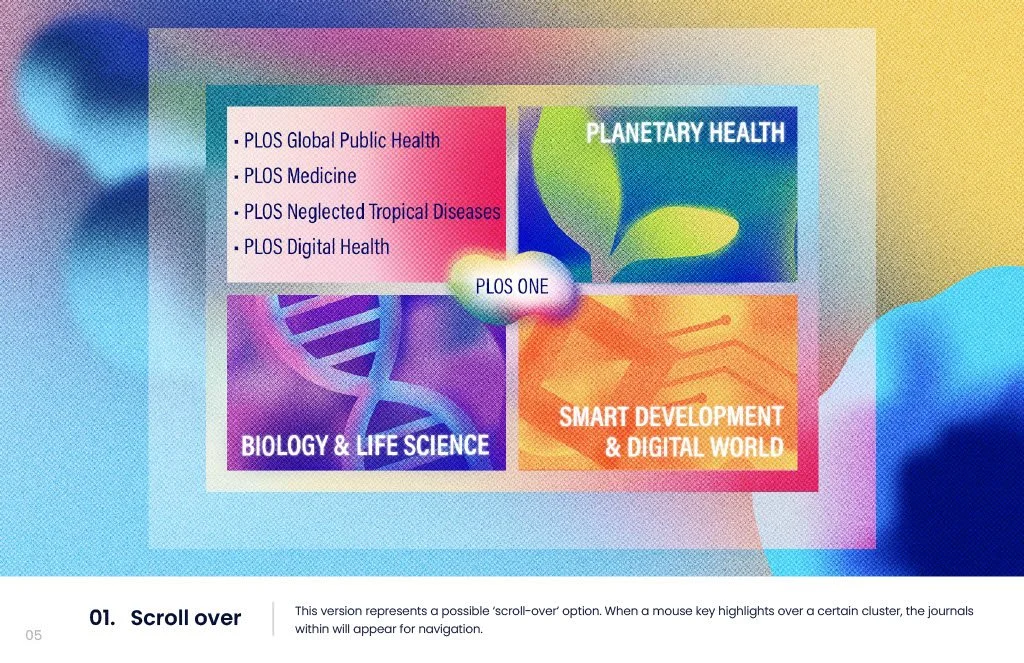
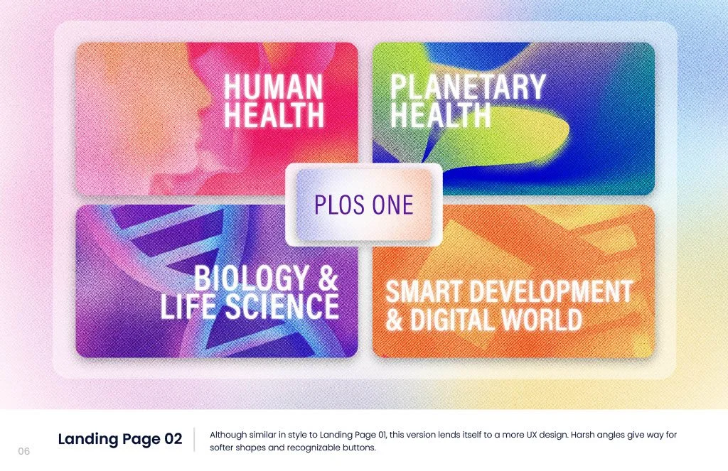
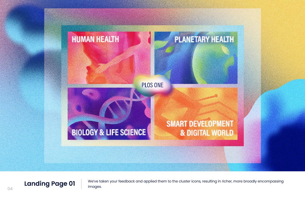
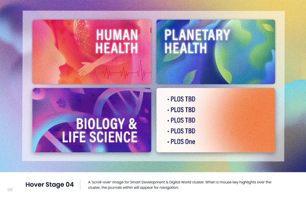
The client decided they wanted the text to be more prominent, they wanted some options for the and that they wanted each sub-category on the homepage to be written out as well. I presented several different homepage options, along with the possibility of scroll-over text labels.


Art direction v4
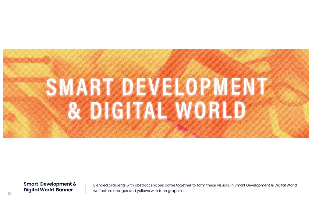
In my initial designs, the images were much more abstract, with only a few recognizable symbols, but the client decided they wanted to add a lot of additional imagery in each image that would fit each sub-category and make the symbolism more explicit.
Another big change the client made was they decided to leave out the central category PLOS ONE that encapsulated each category.


Sample of Animation
There were tons of assets in the final deliverables:
4 icons
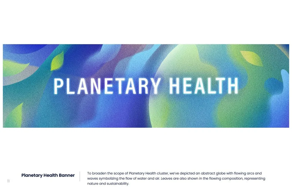
4 landing page banners
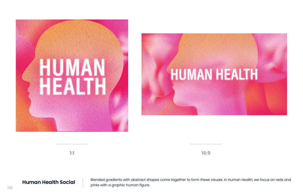
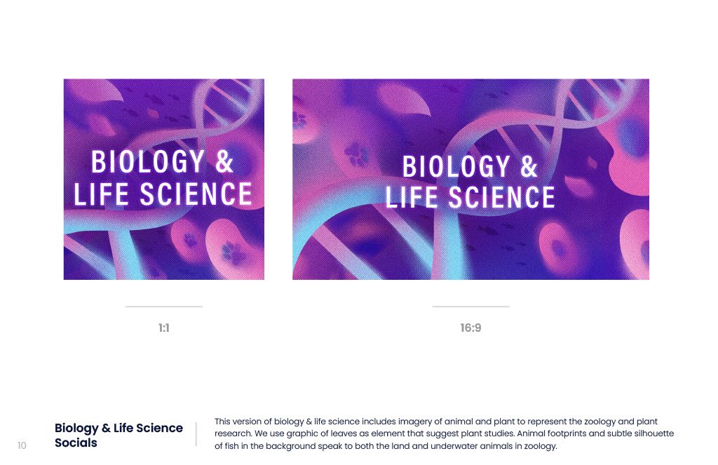
16 total social assets - Each of the 4 icons need social assets (linkedin, twitter, facebook, instagram (1x1)
Here are some samples of the subtle animation. These are site headers without text.