

AMERICAN GREED TITLE SEQUENCE AND SHOW PACKAGE
Music: America the Beautiful - Immediate Music (from the album “Dark Patriotic Covers”)

Film Process
This was filmed in my childhood bedroom during the COVID-19 pandemic on an iPhone 8 using the built-in high-speed camera.
In order to get enough light for the high-speed camera, I used two LEDs and shot with the window open. Pointing the phone out the window and holding down on the screen locks the iPhone camera iso. I draped a bedsheet on a dresser to use as a black drop.
American Greed Current Title Sequence


Concept
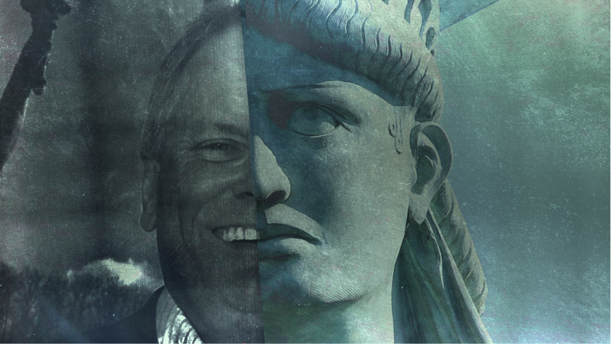
American Greed distinguishes itself from other white-collar crime docuseries through its pulpy tone and focus on a microeconomic scale, how financial crimes affect individual Americans, rather than the larger-scale political and global implications of such crime. This title sequence reflects this grim, investigatory tone of show and the connection between greed and “Americaness”.
Ideation and process
I generally start my design process by getting my hands dirty instead of taking notes or making word maps or something similar. By that I don’t mean I jump straight into making frames or animating, but that I take pictures, start manipulating assets, I react instinctively to see what feels good and correct. Generally, I think of movement, texture and “feel” are just as important as symbolism or the general design. They’re inseparable in my mind and that’s just the way I think.
This was very much a design by subtraction process. In the different itertions of the frames below you can see me getting closer to the core idea.
As an experiment I created some “bigature” images of an $100 bill by printing an upscaled version of the bill. While I liked the way the light shone through it, I eventually decided not to use it due to the lack of texture. The initial frames are green, taken from American Greed’s current title colors and well…money. I also printed out a bill and put it quickly in and out of a shredded and then made this shredded American flag/dollar asset. I thought it was interesting but maybe a bit too on the nose.
I got incredibly attached to the idea of using shredded documents and some photo montage, i.e. the montage in the Adam McKay film “The Big Short”, to showcase American culture and greed, but it was turning into two or three separate ideas. I also was coming off a project that was heavily tactile and used lots of paper assets so that’s why it was starting to creep into my thinking. In the early drafts of my frames you can see me still trying to force this idea of shredded paper, but I had found this PSA “Redevelopment” from 1974 on archive.org with incredible time-lapse and slow-motion footage of bank buildings which was really moving me towards something cinematic.
What I settled on was using a macro lens to examine bills and objects closely as a way to represent the hard-nosed investigative tone of American Greed. This idea is taken further by literally “shining a light” through the bills and objects and bringing them in and out of focus. A big part of what I was trying to avoid was using headlines and the “redacted,” or crossed out type that is used in many true-crime titles. I thought avoiding those thngs was a good way to help the title stand apart. One thing that was carried on from the initial frames though this really grimy, gritty and dirty texture and tone.
Type
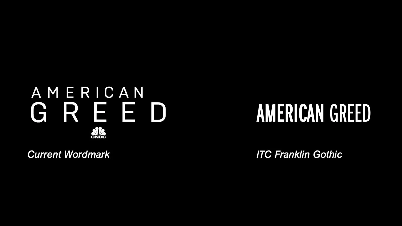
My three goals behind this new wordmark:
1. A more stable and authoritative typeface.
2. Using weights instead of the point size to keep it solidly together
3. Emphasize American rather than greed.
Initial Styleframes


Intermediary Styleframes
Before dropping the paper ideas entirely I created some frames with it used more sparsely. I could probably could have been convinced to use some of this, but I didn’t think it was necessary in the end.


Final Styleframes


Shredded Dollar Flag
15x Macro Bill
15x Macro Flag
“Bigature”